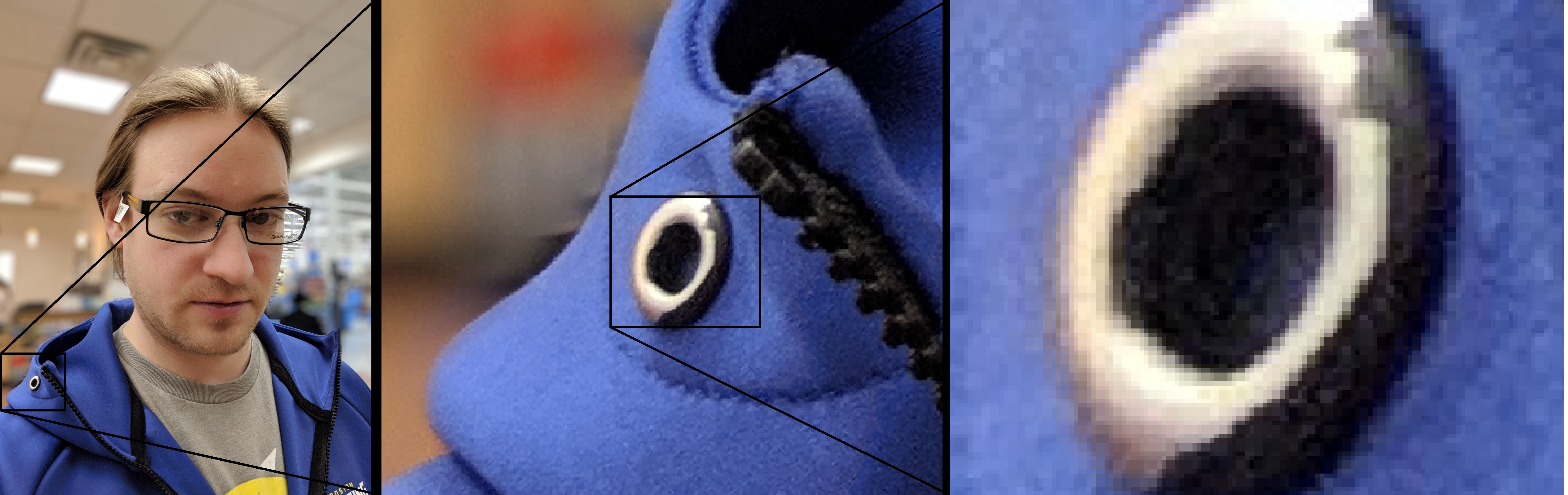
Having recently picked up Adobe Illustrator, I decided I wanted to convert a photo of myself to vector art. For anyone who may not know, digital images are generally considered to be either raster or vector. Raster images contain data for each and every pixel in the image. This is used for photographs. Vector on the other hand, uses objects such as lines and shapes to describe how to draw an image. Since most computer displays are pixel based, your computer always displays a raster version of images. This means that the image above is the raster image of a vector image of a raster image…
There are advantages to both types of images, but the advantage that you get from storing an image in vector format is scale-ability. It can be scaled up to any size without any loss of quality and you can generate any size image from the original vector image without any change in the original file’s size. That means that the same file can be used for a business card as well as a billboard. The image will have no trouble scaling up and will not look like it has been stretched out. I would like to take a moment to share the process I used to make this image. I am not a professional so I make no claims as to the best process for this, this is just my self-taught technique.
Some talented people can start from a blank slate but I am not there. I started from a reference photo. To start I had to find a photo that I liked. Fortunately for me my phone take pretty good portraits. While I am not prone to taking selfies, I have a few in my library. I found a decent one from the last time I was buying new glasses. The funny thing about buying glasses is that you are expected to try on the frames without your RX. Depending on how bad your vision is, you may not be able to actually see what you look like with the frames. Rather than just looking at my blurry self in the mirror, I take a picture of my self with my phone. Here is what I chose to use as a reference.

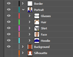
I work in a very iterative method where I build up layers with increasing levels of detail. My process is little more than just tracing the photo. I am going to show a few interim steps to help illustrate my process. The first step (for me) was to decide what order in which to stack the objects. The below capture of my layer stack show I ordered the layers from bottom to top as Hoodie, Face, Shirt, Hair, and finally Glasses. You can also see that I have a Border for the whole image sitting on top of everything, and a Background, and an inverted Silhouette sitting underneath everything. I will talk about those later though.
The reasoning behind the layer ordering is pretty straightforward, but does require a decision to be made at the start. The Glasses, Hair, and Shirt all sit in front of the skin, which I have bundled as the Face, and the Hoodie can be seen as wrapping around the back so I made it the lowest layer. In order to explain my decisions in a little more detail, I need to talk about vector images a little more. It may seem like I am going off on a tangent, but understanding these fundamental elements of vector images will help with understanding my layering decisions.
As I said before, a vector image is a set of instructions describing how to draw an image. There are usually different types of objects that can be drawn such as rectangles, ellipses, lines, and text. Regardless of the type of object, there is going to be a path which the program displaying the vector image must generate. When it comes to the appearance of an object in a vector image, there are three main properties: fill, stroke, and opacity.
The fill, as you might guess, describes how to fill the inside of the path. Note that a path does not need to be a closed shape like a rectangle or ellipse in order to be filled. In the cases where the path is not a closed loop, an imaginary line is drawn between the start and end of the path, and used to determine the “inside” of such an object. The fill can be empty, meaning that you can see through the object, or it can be filled with a color. Most vector image editing software allows you to fill an object with a raster image as well.
The stroke describes how to draw the path. This can include both the color and the width of the path. Usually there will be a number of other properties you can edit for the stroke such as pattern if you wanted to make it a dashed or doted line. You can add arrowheads to the path and even select rounded or square corners. For my purposes though, I only used the basic color and width properties of the stroke.
The opacity simply specifies how opaque or transparent an object is and is typically represented as a percentage. Adobe Illustrator allows you to not only set the opacity for an object, but also for a group of objects. For the opacity of a group of objects, the group is rendered and then the opacity is applied. This allows the group to retain a consistent appearance as you adjust the opacity. My final image uses almost no transparency with all the objects being 100% opaque except for the lenses in the glasses. I wanted to have a slight tint to them. However I still found the property to be extremely useful for the process of creating the image. I would keep the objects roughly 50% opaque while working on them, and them return them to 100% opacity to see how they looked without the background to distract me. Here is an example of what that looks like.
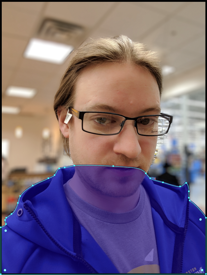
In the above photo you can see how I traced the hoodie’s general shape without regard for any objects that would fall in front of it. This is because I had decided to place the hoodie at the bottom of the stack, and place all other objects on top of it (excluding the background of course). The ultimate reason for this decision has to do with the stroke properties of the objects. I wanted the stroke for the neck to be visible as it descended into the hoodie, but I did not want the stroke of the hoodie to run down parallel with the neck line. It probably would have worked just fine, but that artistic decision I made at the time.
I should make note that I pretty much exclusively used the Curvature Tool in Adobe Illustrator to get the rough shape that I wanted. I then went back with the Direct Selection Tool to make the fine adjustments. In the above picture with the transparent hoodie, you can see the cyan outline with little squares along the path. Those little squares are anchors. One get created everywhere I click while using the Curvature Tool. Then by switching over to the Direct Selection Tool, I can re-position those anchors, and adjust the arc of the curvature as it moves towards the next anchor. The anchor points can added and removed from the path as well. All these things allow me to fine-tune the shape to exactly what I want. It just become a matter having the patients to take the time and get it right.
I almost forgot to talk about the background layers. The one is solid and the other is a silhouette. The solid one is pretty straightforward. It is just a solid color background. The silhouette however, I was playing around with letting certain amounts of the original image through. I was trying to cheat and use the reference photograph to add detail to the image. It actually works fairly well I would say, but I can’t really do it with this particular photograph because there is a tag on the glasses that I did not want to be part of the final image. But I can see myself using this effect in the future for some other project. For the following image, I set the silhouette background to 100% opacity, and all the components of my portrait to 80% opacity.
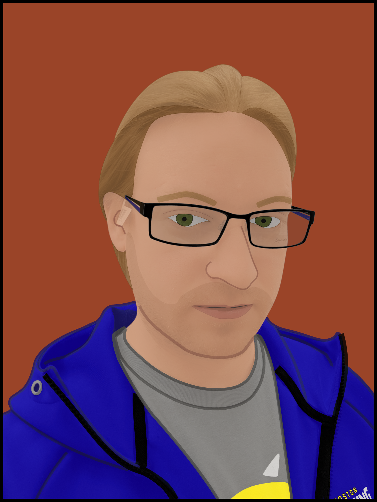
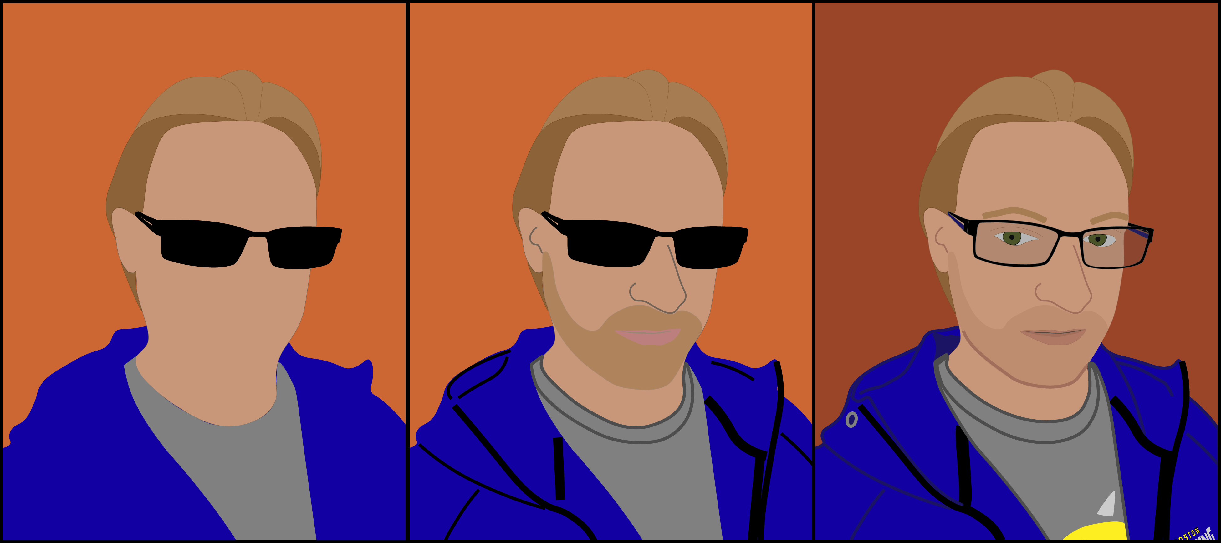
When I say that this was an iterative process I really mean it. I spent maybe 30 minutes to an hour laying out the rough shape. Then I spent a couple hours making what I would call “version 1” and even posted it to my Instagram page. But after a few days I decided that I wanted to refine the image more and several hours adding a lot more detail. On top of enhancing the level of detail, I also tweaked the colors a fair bit to be more realistic. Here is a comparison of the rough shape, the original, and revised versions. If I were to do it again, I think it would go a little more quickly as a result of the experience gained from this project.
As I stated in the beginning, this is just the method I use and may not be the right method for everyone. An interesting feature that some vector image editing software has is the ability to convert photographs into vector images automatically. If you enable the quality to be high enough, and if you tart with a high enough quality photograph, they can be nearly indistinguishable from a normal viewing distance. For fun I am leaving two more images to illustrate the differences between raster and vector. I am pretty sure this is my longest post yet. I hope anyone reading this found it interesting or was able to learn something from it. I plan to do more informative posts like this in the future!